Visual systems
Tokens, scales, hierarchies, motion — the architecture beneath consistency.
Portfolio presentation. Please enter the password to unlock.
I’ve spent 25 years designing visual experiences for consumer media and storytelling brands — and I’d like the next chapter to be more considered.
Yahoo · Design Director across Entertainment, Music, and Video. Sony Pictures Television Networks · VP of UX across Crackle, Animax, and Sony Networks. Today I run my own studio — Wagabaza — where the last five years have been rapid: problem in, solution out, next one up.
The design world is changing more quickly than it has in my career. I’d like to keep developing inside it — at depth, not velocity. On a team that’s raising its bar on visual design and brand.
What I’ll show you
design.wagabaza.com — a live, configurable visual system I built and ship
A healthcare command center designed end-to-end. Visual language, product, and code.
A podcast brand I designed and built — and why this role caught my attention.
~28 MINUTES PRESENTATION / ~30 MINUTES Q&A
001 — DESIGN SYSTEM
A live, configurable design language that ships.
The thesis
A configurable design system that runs in the browser. Choose a place, a time, a season, a weather — and the system regenerates an opinionated, complete visual language: typography stack, color palette, spacing scale, motion, elevation, components.
The output isn’t a downloadable Figma file. It’s a spec: tokens, decisions, and rationale, ready to ship.
FIG. 01 — Reference home, Pacific locale
What it proves
I think systemically about visual language. I design and I build. And I use AI as a build partner, not a replacement for craft.
Tokens, scales, hierarchies, motion — the architecture beneath consistency.
Next.js 15, Tailwind v4, TypeScript. Shipped on Vercel. Not a deck — a product.
Claude Code, Gemini, Figma Make. Velocity without sacrificing the craft.
002 — PRODUCT
A high-risk patient command center for healthcare executives.
The brief
Take three partner technologies — Tuva (clinical data model), Snowflake Cortex (AI/ML), Omni Analytics (embedded BI) — and make them feel like one opinionated, healthcare-grade product.
Two hard deadlines. Audience: healthcare executives. Stretch goal: present alongside Omni’s CEO at a Databricks conference.
FIG. 02 — AXIOM landing, post-sign-in welcome
Design move 01 · Subtract until it sharpens
One persona, told well, is more convincing
than two personas told approximately.
Started with
Care Manager + Medical Director
Two personas. The buyer’s org chart had both.
Cut to
Care Manager .
One persona, executive-recognizable, story-shaped. The whole demo sharpened.
Design move 02 · Layer, not screen
A persistent conversational AI bar across every screen, with per-screen contextual prompts. Snowflake Cortex stopped feeling like a separate page and became a layer that lives next to the work.
Two problems solved at once: trust — the AI is contextual to whatever the user is looking at — and rescue — if a viewer wanders off the guided tour, Blobby’s prompts pull them back into the narrative.
FIG. 03 — Blobby, persistent AI layer, contextual per screen
Design move 03 · Design-to-code, end to end
Migrated the prototype to a production Next.js app so it could absorb the Omni iframe cleanly and embed into Astrodata’s marketing surface. Run from my own repo with Vercel auto-deploy; collaborator PRs pulled, reviewed, and merged through my workflow.
Established that Omni’s text and markdown tiles support inline HTML/CSS. The dashboards carry the AXIOM language — typography, color, hierarchy — rather than the BI vendor’s signature. Cross-iframe interactions wired through postMessage.
Outcomes
Reflection
Visual design at scale is knowing
what to remove.
Two of the three biggest design decisions here were subtractions: cutting a persona, treating the AI as a layer instead of a screen. The work was about removing things until what was left felt inevitable.
003 — SIDE PRACTICE
The Beautiful Game, Explained. A podcast brand I designed and built.
The brand
The Beautiful Game,
Explained.
A podcast for Americans newly curious about soccer ahead of the 2026 World Cup. Brian Falk hosts; I’m the designer and developer.
Brand identity. Website. Publishing pipeline. Bluesky / AT Protocol social distribution. The whole stack from visual language to listener reach.
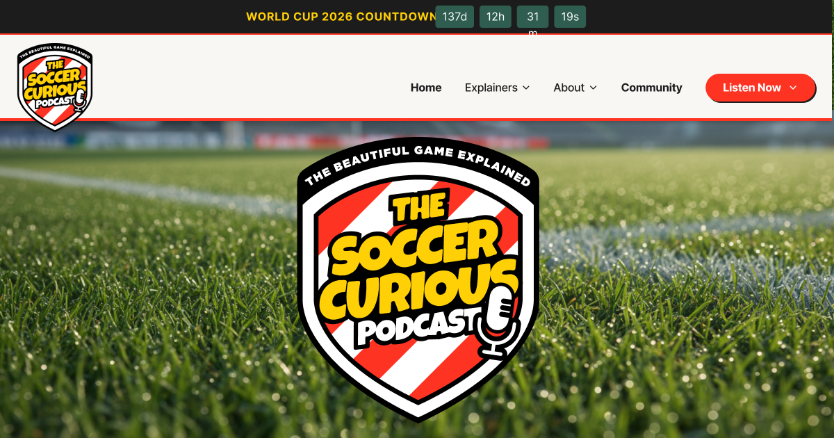
FIG. 04 — Soccer Curious, brand cover
Why I built it
There’s something specific about designing
for a medium where the words live
in someone’s ears.
The visual language has to support listening, not interrupt it. The brand has to feel like the show sounds. I’ve been thinking about that problem on my own time — and I’d like to do more of it.
What I’m looking for
The chance to do
this work
inside a brand whose mission
I actually care about.
Visual systems. Product design. Hands-on craft. Inside a brand at the intersection of visual experience and audio storytelling — where the bar is unusually high and the medium is genuinely interesting.
Now — your turn
matia@wagabaza.com ·
310.447.4521
portfolio.wagabaza.com ·
design.wagabaza.com
Thank you for your time.
matia@wagabaza.com · portfolio.wagabaza.com · design.wagabaza.com
| → / Space | Next slide |
| ← | Previous slide |
| Home | First slide |
| End | Last slide |
| N | Toggle speaker notes |
| O | Overview (all slides) |
| F | Fullscreen |
| 1 – 9 | Jump to slide |
| ? | Toggle this help |
| Esc | Close overlay |